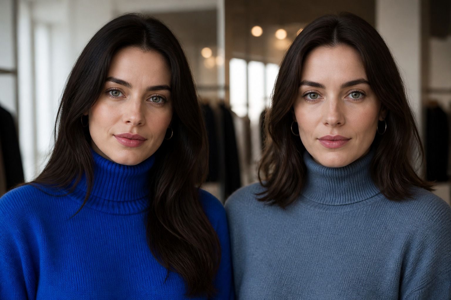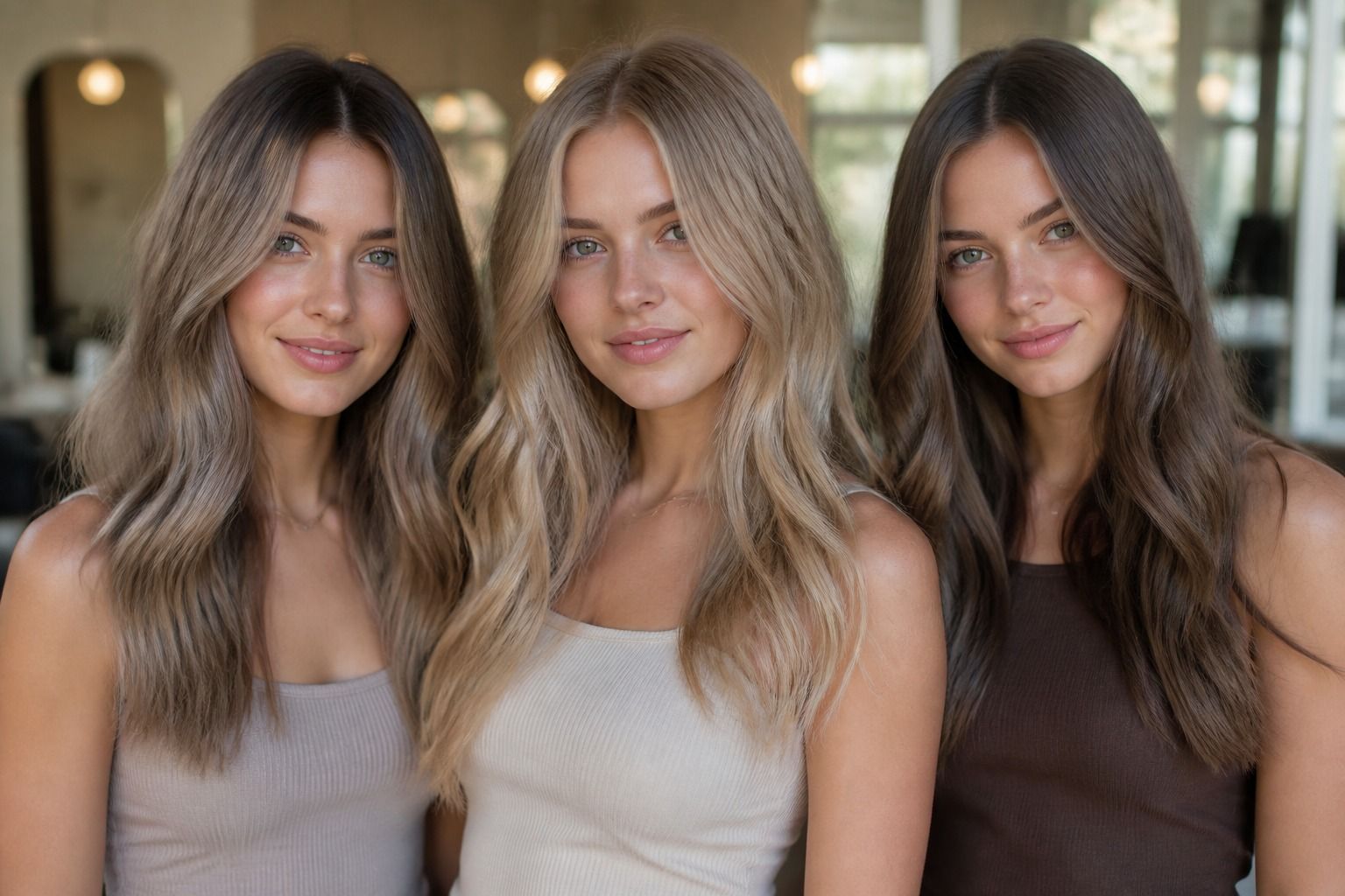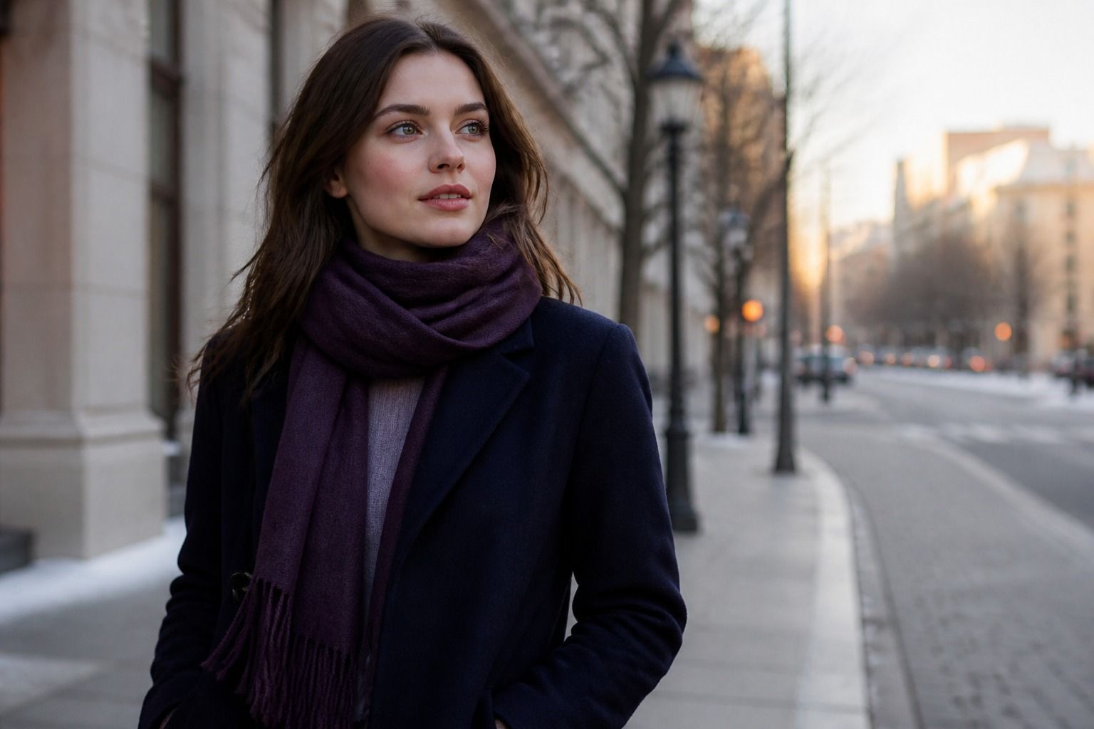
Soft Winter is easy to misunderstand because the name sounds gentler than the colors usually associated with winter. The palette is cool, deep enough to hold contrast, and softened enough that pure black, optic white, or a very clear jewel tone can look louder than the person wearing it. That is why a useful soft winter color palette is less about collecting a fixed set of approved swatches and more about judging the relationship between temperature, depth, clarity, and the colors next to your face. In practice, the best choices often sit between dramatic Winter and misty Summer: ink navy instead of hard black, cool rose instead of hot pink, and a dark neutral that still has a little smoke in it.
Where Soft Winter Sits in the Seasonal System
Seasonal color analysis is a shorthand for comparing the visible effect of color, not a permanent identity card. Soft Winter is usually described as a cool season with moderate-to-high depth and lower clarity than Cool Winter or Bright Winter. The word “soft” refers to the finish of the color: slightly grayed, shaded, or smoky. It does not mean pale, beige, or warm. A charcoal plum can be soft and wintry; a light peach can be soft in a general sense but still pull too warm.
The easiest comparison is with the neighboring seasons. Cool Winter generally tolerates cleaner blue-reds and sharper contrast. Deep Winter can carry espresso, black, and very dark forest green with more authority. Soft Summer shares the muted quality, but its best colors are often lighter, cooler, and less forceful. If a cool rose blouse looks balanced while a blue-red blouse makes the face seem separate from the fabric, softness may matter more than extra saturation. If every smoky color makes you look tired, the issue may be insufficient depth or contrast rather than a failure of the palette.
Look at the whole face when testing the season: skin, eyes, brows, hair, and the shadows around the nose and mouth. A color that makes the eyes clearer but emphasizes redness in the cheeks is not automatically a winner. Test the same top in daylight, with no foundation that changes the skin surface, and compare it with a color from another family at the same depth. The useful question is not “Can I wear this?” Almost everyone can. It is “Does this color support the face, or do I have to compensate for it with makeup and styling?”
Neutrals Beyond Stark Black
Black is the first trap for many people exploring a winter palette. It is convenient, available everywhere, and often looks perfectly respectable. Yet a black crew neck can create a hard horizontal line under the chin, especially when the hair is lighter, the skin is delicate, or the overall coloring has a muted quality. Soft Winter does not need to abandon dark neutrals; it needs to choose darkness with some atmosphere in it.
Ink navy is usually the most useful starting point. It gives a dark, cool frame without the graphic effect of pure black, and it works with denim, silver jewelry, cool white, and muted berry shades. Charcoal is another reliable option, particularly in wool, brushed cotton, or matte knitwear where the texture already reduces glare. Blue-charcoal, graphite, smoky aubergine, and a cool espresso can also work when their undertone is visibly cool rather than reddish or golden.
| Neutral | What it does near the face | Good pairings |
|---|---|---|
| Ink navy | Creates depth with less hardness than black | Cool white, dusty rose, plum |
| Graphite | Keeps a tailored look while lowering contrast | Steel blue, mauve, blue-red |
| Smoky aubergine | Adds color without becoming a bright accent | Soft lilac, pewter, cool berry |
| Blue-charcoal | Balances dark hair and muted complexions | Frosted blue, rose brown, silver |
| Cool espresso | Offers a brown alternative when warmth is restrained | Plum, slate, muted cranberry |
Cool white deserves the same careful treatment. A blue-based white can look crisp without the yellow cast of cream, but the brightest version may still be too stark if worn as a solid shirt under the face. Try a softened white, pale oyster with a cool cast, or white broken up by a navy cardigan. The fabric matters: satin reflects more light than brushed cotton, so a color may look considerably sharper in a shiny blouse than in a matte T-shirt.
Accent Colors for Clothing and Makeup
The most convincing soft winter colors have enough pigment to remain visible beside a dark neutral, but not so much clean brightness that they become the first thing anyone notices. Plum, blackberry, muted cranberry, blue-red, dusty raspberry, and cool burgundy are useful because they carry depth without relying on orange or yellow. A plum sweater with ink navy trousers often reads more coherent than a black sweater with a vivid fuchsia scarf, even though both combinations belong to a broadly cool family.
Blue is particularly revealing. Look for slate blue, smoky sapphire, petrol blue with a cool base, and softened cobalt. Turquoise can work when it leans blue and is toned down, but a tropical aqua may expose the difference between Soft Winter and a brighter Winter season. Greens are worth testing individually rather than accepting or rejecting the whole family. Blue spruce, eucalyptus with a cool cast, dark teal, and muted pine can be strong choices; yellow olive and warm moss usually shift the face in another direction.
Makeup should follow the same temperature and contrast logic without turning the face into a color chart. A neutral-cool rose or muted berry lip often looks more integrated than orange-red. For cheeks, rose, mauve, and cool raspberry are safer starting points than apricot. Eyes can take charcoal, pewter, soft navy, cool taupe, and muted plum. Silver, white gold, and pewter jewelry tend to repeat the palette’s coolness, while a very yellow gold may need either a softer finish or a cooler makeup balance. These are tendencies, not laws: the scale, texture, and distance from the face can change the result.
When putting an outfit together, let one element carry the deepest value and keep the remaining pieces within a related range. A graphite jacket, dusty rose knit, and dark denim has quiet contrast. A black jacket, optic-white shirt, and electric blue bag has sharp contrast, even if every color is technically cool. Soft Winter often looks most deliberate when the contrast is visible in the outfit but not cut into separate blocks at the face. A scarf, collar, or necklace can soften that boundary if the colors are otherwise right.
Hair Shades That Support the Season
Hair color has a larger visual area than lipstick, so a small temperature mistake can change the impression of an entire wardrobe. Soft Winter hair usually benefits from a cool or neutral-cool direction and enough depth to connect with the eyes and brows. Ash brown, cool medium brown, mushroom brown, muted espresso, and soft black-brown are sensible references. The exact level depends on the natural coloring: a pale ash brown may be harmonious on one person and make another look washed out.
Be cautious with strong golden balayage, copper, honey, and orange-based chestnut if your face already looks more even beside blue, mauve, and berry colors. Warm highlights can be attractive as hair in their own right, but they may make a cool complexion look pinker or make the whites of the eyes seem dull. This is where a strand test is more useful than a salon color name. Place the sample beside the cheek in daylight, then check it against your usual clothing. A “cool beige blonde” can still read yellow beside a Soft Winter face, while a neutral mushroom tone may look more natural than the label suggests.
Very high contrast between nearly black hair and lightened ends can also feel too sharp. If you want dimension, ask for low-contrast ribbons in ash, smoky brown, cool plum-brown, or a shade close to the natural root. The goal is not to flatten the hair into one solid block. It is to avoid a bright warm stripe that competes with the face. Hair depth should support the brows and eyes rather than forcing the clothing palette to become darker just to keep up.
Before a permanent change, test three things: the shade in daylight, the shade beside your bare skin, and the shade with your most-worn neutral. Take a photo from a normal conversational distance, not only a close selfie. A hair color can look refined in a salon mirror under warm bulbs and surprisingly brassy beside an ink navy coat outdoors. If the result is close but not quite right, a cooler gloss or a less golden toner may solve the problem without a dramatic color correction.
Common Mistakes When the Palette Feels Too Sharp
The first mistake is treating “Winter” as permission to wear the strongest version of every Winter color. Pure black, fluorescent fuchsia, optic white, and high-saturation cobalt may all be cool, but temperature is only one part of the comparison. If the face disappears behind the garment, reduce clarity or contrast before changing the entire season diagnosis. Swap black for ink navy, bright white for cool white, and a clear jewel tone for its smoked or berry-based neighbor. The difference is often visible immediately around the eyes and jawline.
The second mistake is confusing softness with warmth. Beige, camel, rust, peach, and golden olive can feel gentle, but their warmth may be more noticeable than their muted surface. Soft Winter colors can be quiet while remaining blue-based. Think of the difference between a rose-brown with a mauve cast and a caramel brown with a yellow cast. Both are subdued; only one is likely to repeat a cool contrast naturally.
Another problem appears when an outfit is judged as isolated swatches. A muted berry top may look dull on a white display card but become balanced beside the wearer’s eyes, hair, and dark denim. Conversely, a beautiful plum may be too deep when worn as a full turtleneck with dark hair and heavy eye makeup. Check colors in the scale you actually wear: a coat, a neckline, a small bag, and a lipstick do not have the same visual weight.
Finally, do not use seasonal labels to overrule your own evidence. If a color repeatedly makes you look rested, gives the skin a more even appearance, and fits the clothes you genuinely wear, keep it in rotation even if it sits outside a neat chart. A soft winter color analysis is useful when it reduces guesswork. It becomes unhelpful when it turns dressing into a test you can fail. Start with cool depth, soften the contrast when black feels severe, and build combinations that let the face remain the most interesting part of the outfit.