Deep Winter is the season I think about when a pale grey T-shirt makes someone look tired, while ink blue, black, or a dark berry shade suddenly gives the face a sharper outline. The useful question is not whether a person can wear a very dark color in isolation. It is whether depth is the quality that makes their natural coloring look settled, clear, and balanced. This guide focuses on the decisions that matter in a real wardrobe: how to tell depth from simple darkness, which neutrals earn their space, how to use jewel tones without making an outfit severe, and what to do when your hair or makeup needs a softer approach.
The role of depth in Deep Winter
In Deep Winter color analysis, depth is the leading characteristic. Colors usually look best when they have a substantial visual weight, a cool or cool-leaning temperature, and enough clarity to keep the face from looking flat. That description is more precise than saying “wear dark colors.” A dusty mushroom brown can be deep yet too muted. A bright lemon yellow can be clear yet too light and warm. The strongest deep winter color palette sits in the darker part of the range without losing definition.
The name Dark Winter is often used for the same or a very similar group. Different systems arrange the seasons differently, so I would not treat the label as a scientific category. I use it as a practical shorthand for coloring that can handle deep blackened tones, strong contrast, and a measured cool-warm balance. The neighboring comparison matters. True Winter is usually more clearly cool and can carry icy brights with ease. Deep Autumn also needs depth, but its best colors lean warmer, earthier, and more softened: tobacco, rust, warm olive, and golden brown are more convincing there than blue-red or icy pink.
There is no sensible rule that links deep skin to Deep Winter. Skin depth and seasonal harmony are separate observations, and people with very light, medium, or deep complexions can fall into the same season. I would also be cautious about judging from a single image. Phone cameras shift white balance, indoor bulbs turn cool colors yellow, and a black top can make almost anyone look more contrasted than they are. For a first check, place several fabrics under the chin in indirect daylight: black, ink blue, a cool berry, a warm rust, and a muted taupe. Watch the skin rather than the fabric. The better colors usually make shadows less obvious, the whites of the eyes cleaner, and the mouth look more defined without makeup doing all the work.
Reliable dark neutrals for everyday clothes
Black is the obvious starting point, but it should not be the entire wardrobe. On a Deep Winter palette, black can look polished close to the face, especially when the garment has a clean surface and a clear shape. The problem appears when every item is flat black, heavily matte, and cut without any variation. The result can feel like a uniform. I get more mileage from three or four dark neutrals that differ slightly in temperature and texture.
| Neutral | Best use | What to check |
|---|---|---|
| Ink blue | Shirts, coats, knitwear, and denim | It should read blue-black rather than soft navy. |
| Cool charcoal | Trousers, tailoring, and relaxed basics | Avoid a brown cast or a foggy grey finish. |
| Cool espresso | Leather, boots, belts, and warmer-looking basics | Look for bitter dark brown, not caramel or reddish chestnut. |
| Black | Outerwear, evening pieces, and high-contrast outfits | Use texture or a lighter accent if the outfit starts to look severe. |
| Deep burgundy | Jackets, bags, knitwear, and a restrained color accent | Choose blue-red wine rather than rust, brick, or orange-red. |
Ink blue is often the easiest substitute for black because it keeps the contrast but looks less rigid in daylight. A dark wool coat over a blue-black sweater can do more for the face than a head-to-toe black outfit, particularly if the eyes are light or the features are delicate. Cool charcoal is useful when black feels too hard for a workday. I prefer a charcoal with a definite graphite quality; the grey-brown “greige” shades that work beautifully for Soft Autumn tend to make a Deep Winter complexion look faded.
Espresso needs a little care. Deep Winter can often borrow this neutral when it is close to black and free from visible orange. It works especially well in shoes, belts, bags, and textured leather, where the color is not sitting directly under the face. A chestnut blazer or camel scarf is a different matter. Those warm, yellowed browns may pull attention away from the face even when the garment itself is attractive. If you love them, keep them lower in the outfit and pair them with a crisp berry, ink blue, or cool white near the face.
Jewel tones without visual heaviness
Jewel tones are a natural part of the dark winter color palette, but “jewel” does not mean every saturated color works equally well. Deep Winter usually handles colors with a dark base and a clean edge: blue-red, cranberry, blackberry, pine green, emerald, deep teal, and cool purple. The most successful shades look concentrated rather than dusty. Hold a garment at arm’s length. If the color appears greyed, chalky, or brown before you notice its hue, it may be too muted or too warm.
Ruby and blue-red are dependable near the face because they give the mouth and cheeks a little definition without relying on a warm orange undertone. Burgundy can be excellent, although the word covers a huge range. A wine shade with a plum or blue-red direction belongs more comfortably in the Deep Winter color palette than a brick burgundy that turns copper in sunlight. The same distinction applies to green. Emerald and blue-pine can look clean; yellow olive and moss usually ask for the warmer depth of Deep Autumn.
I would introduce one strong jewel tone at a time when an outfit already contains black or ink blue. A berry sweater with charcoal trousers feels controlled. A dark teal dress with black shoes has a clear line. Three competing saturated colors can make the clothes arrive before the person, even when each shade is technically plausible. Contrast is a resource, not a requirement to use the maximum amount every morning.
Makeup offers a smaller, safer test than a coat. Try a cool berry lip, a raspberry stain, or a blue-red pencil and look at the whole face in window light. If the color gives the skin a quiet evenness, it is worth exploring. If the lips look detached and the complexion turns grey, the issue may be temperature, not depth. Deep Winter does not require a dramatic lipstick. A sheer plum balm can support the palette when a full opaque red would make the rest of the face feel under-finished.
Choosing hair color by depth
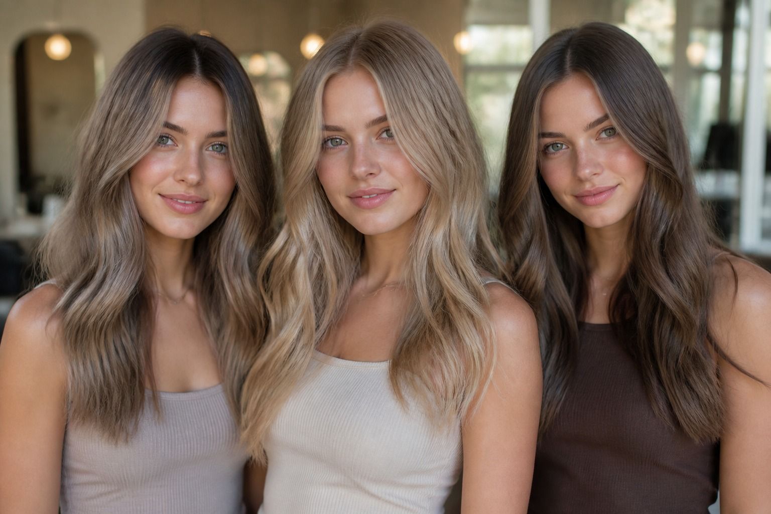
Hair is where a good deep winter color analysis often becomes practical. Because it frames the face every day, its depth changes how much contrast the wardrobe can carry. Natural dark hair can usually stay close to its original level, with cool espresso, deep ash brown, soft blue-black, or a restrained burgundy glaze as possible directions. The goal is a color that looks dense and intentional without turning the hair into a single hard block.
Blue-black is striking, but I would test it before committing. On someone whose natural hair is already very dark and whose features have clear contrast, it can look elegant. On someone with lighter brows, pale lashes, or a low-contrast face, the same shade may make the hair dominate. A deep neutral brown is often more forgiving. It keeps the high-depth effect while allowing the eyes and skin to remain part of the picture.
Warm gold, copper, honey, and orange-red are the common wrong turns. They can be beautiful colors, yet they introduce a yellow or red heat that competes with the cool-warm balance of Deep Winter. The problem is not that the hair becomes lighter; a cool medium brown can work for some people. The problem is uncontrolled warmth and a sudden loss of the dark frame. If hair has been lightened, a smoky ash or cool beige transition may be easier to live with than repeated attempts to force it back to black.
Look at roots, brows, and hair ends together rather than judging a salon swatch on its own. I have seen a shade appear cool on a sample card and turn warm beside an existing golden balayage. Ask how the color will age, how much maintenance the root line needs, and whether the finish remains even after several washes. A Deep Winter hair color should support ordinary mornings as well as carefully styled photographs. If the shade only works under studio lighting, it is not doing enough practical work.
How to soften the palette without losing presence
A high-depth palette does not require stiff tailoring, glossy fabric, or a serious expression. Softness can come from surface and proportion rather than from pushing the colors into beige. A brushed knit in ink blue, a washed charcoal T-shirt, or a matte berry blouse can reduce the formality of a dark winter color palette while keeping its visual weight. I pay attention to the boundary around the face: texture should diffuse the edge slightly, but it should not turn the color cloudy.
Cool white is useful when black feels too dense. It creates the clear contrast Deep Winter needs, especially under a dark jacket, but it reads fresher than cream. If pure white feels stark, try a clean pearl grey or a very pale icy blue instead of yellow ivory. Those lighter shades can open the outfit without weakening the overall structure. The test is simple: does the pale color make the dark one look deliberate, or does it make the skin look dull?
Proportion is another quiet control. A full black outfit with a sharp jacket, pointed shoes, and high-contrast makeup can feel formal even when the occasion is casual. Keep one strong element and relax the rest: an ink-blue sweater with straight jeans, a burgundy scarf with a charcoal coat, or a dark dress with soft hair and simple shoes. The palette remains present, but the styling stops shouting.
When a color seems almost right, compare it with its nearest neighbor instead of abandoning the whole season. Put cool burgundy beside brick, ink blue beside warm navy, and espresso beside camel. The difference is easier to see in pairs than in a crowded shop mirror. The Deep Winter color palette is built around concentration, clarity, and depth, yet personal coloring still decides the final balance. Use the season as a working map, keep the colors that make your face look rested, and leave the ones that require a dramatic outfit, heavy makeup, or perfect lighting to appear convincing.