Deep Summer is the point where a cool, softened palette gains enough depth to feel grounded. It can suit someone who looks washed out in pale pastels but overwhelmed by the hard edges of black and optic white. The useful question is not whether a person can wear a certain shade in isolation. It is whether the color lets the face stay present when the whole outfit is viewed in ordinary daylight, under office lighting, and beside the gray-brown clothes most of us actually wear.
What Makes Deep Summer Different From Other Summer Seasons
Deep Summer is used in some extended seasonal color systems for the darker end of the Summer family. It is not a universal category, so I treat the label as a working description rather than a verdict. The shared features are usually a cool or cool-neutral undertone, moderate softness, and more visual depth than people expect from a typical Summer palette. Hair, eyes, and skin may create a quiet contrast: the features are distinct, but their edges do not look sharply outlined.
This is where comparisons with True Summer and Soft Summer help. True Summer usually looks most at home in cool, balanced colors of medium value. Soft Summer leans further toward dusty, blended shades and often dislikes anything too clear. Deep Summer can borrow from both, yet it has more tolerance for ink blue, aubergine, deep berry, and cool charcoal. Put a soft mauve next to a deep berry and the distinction becomes easier to see: the first melts into the complexion, while the second gives the face a little structure without creating a hard frame.
The risk is confusing depth with intensity. A color may be dark and still muted. A smoked plum is deep but softened; a highly saturated royal purple is deep and forceful. The latter can take over a low-contrast face. In a deep summer color analysis, I would check three things in order: temperature first, then softness, then depth. If the shade is warm, clear, or stark before it is even dark, it is probably solving the wrong problem.
How Depth, Softness, and Contrast Work Together
Think of the Deep Summer color season as a dimmer switch rather than a box of approved colors. Depth tells you how far toward the shadowed end of a color you can go. Softness tells you how much gray or smoke the color can carry. Contrast tells you how much difference you can place between neighboring pieces before the outfit starts speaking louder than your face.
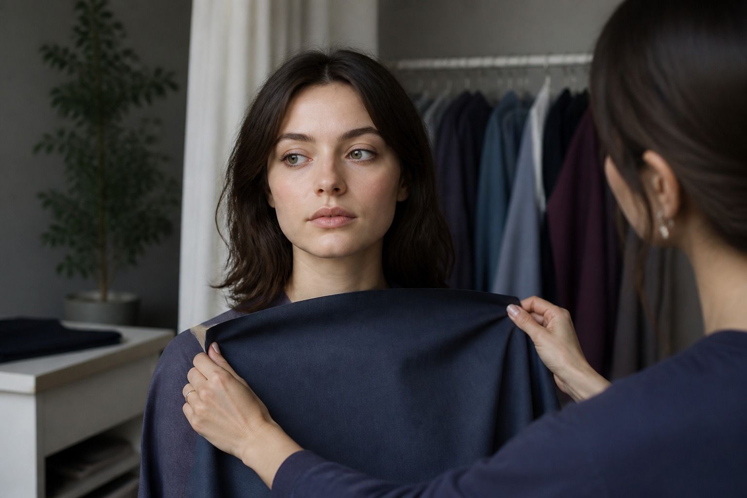
A useful test is to assemble three versions of one outfit: a pale blue-gray with a medium slate, the same blue-gray with deep navy, and the same blue-gray with black. Take a quick photo in indirect daylight, then look at the eyes and the area around the mouth rather than judging the garment. Deep navy may make the features clearer. Black may create a visible border at the jaw, making skin texture and shadows more noticeable. If the face seems to recede, the color is too hard even if the outfit looks polished on a hanger.
| Color role | Useful Deep Summer direction | What to watch for |
|---|---|---|
| Light base | blue-gray, cool shell pink, misty lavender | yellowed ivory or chalky white can make the skin look uneven |
| Everyday dark | charcoal, ink navy, blue-black, cool espresso | flat black may be too sharp near the face |
| Accent | berry red, cranberry, muted teal, aubergine | orange-red, tomato, and neon clarity can overpower softness |
| Metal and detail | brushed silver, pewter, soft white gold | bright yellow gold may read warm before the outfit is noticed |
There is no prize for wearing the deepest possible shade. When a dark color makes the complexion look gray, move one step lighter or add softness. When a muted color makes you look vague, keep the softness but increase the depth. That small adjustment is often more useful than switching seasons altogether.
The Neutrals That Build a Wearable Wardrobe
Neutrals do most of the work in a practical deep summer color palette. They decide whether the brighter colors can be worn repeatedly or remain stranded in the back of the closet. Charcoal is often the easiest starting point because it provides authority without the stark outline of black. Look for a charcoal with a blue, violet, or neutral cast rather than one that turns brown in warm light.
Ink navy is another strong dark. It works for coats, trousers, knitwear, and formal clothing, but the best version is usually softened rather than shiny. A matte navy wool coat can sit close to the face; a very bright navy synthetic jacket may reflect too much light and make the color feel more intense than it looked in the shop. When trying one on, step away from the mirror. At arm's length, the surface and the color should still feel quiet.
Cool brown deserves a place here, although it needs careful selection. Think cocoa, mushroom brown, taupe, or a coffee shade with a gray base. Red-brown leather, caramel, camel, and orange-beige are different propositions. They may be attractive colors, but their warmth can make a cool complexion look dull or slightly sallow. A cool brown bag with charcoal trousers can be easier to wear than a whole brown outfit, because the temperature shift is kept away from the face.
For light neutrals, blue-gray, dove gray, soft white, and muted mauve are more dependable than bright white or cream. I like to test a light neutral against the throat and collarbone, not only against the hand. Hands are often more sun-exposed and can give a misleading impression. If the light fabric makes the skin look smoother while the dark neutral keeps the eyes defined, you have the beginnings of a useful wardrobe range: one for clarity, one for depth, and several colors between them.
Accent Colors That Keep the Palette Cool
Deep Summer accents work best when they look shaded, slightly grayed, and cool. Berry red is a reliable example. Cranberry, raspberry, wine rose, and cool burgundy can bring color to a face without the orange push of tomato red. The right berry has a blue or neutral base and tends to look more like fruit after dusk than a bright lipstick display under store lights.
Purples can be very effective, from smoked plum to aubergine and muted violet. Watch the red content: a warm eggplant may turn reddish-brown near the skin, while a cooler aubergine keeps the face calmer. Blue-green shades also deserve testing. Dusty teal, pine softened with blue, and muted peacock can add interest to a restrained wardrobe. Emerald that is very clear and yellow-leaning is more demanding; a blue-leaning version with some gray usually behaves better.
Blue is the broadest part of the palette, but not every blue is equally useful. Denim, slate, storm blue, faded sapphire, and deep periwinkle can all work when their surface is not too bright. Electric cobalt often brings a level of contrast that is hard to balance. If you love it, use it in shoes, a small bag, or a lower garment before placing it beside the face.
The same principle applies to pink. Dusty rose, raspberry pink, mauve, and cool blush usually sit naturally with Deep Summer neutrals. Very pale pink may be too weak unless it has enough gray or is paired with a dark that supports it. Warm coral, peach, apricot, and salmon are useful comparison colors because they reveal temperature quickly. Hold one next to a cool berry and look for which shade makes the whites of the eyes appear cleaner. This is not a scientific test, but it is a practical visual clue.
Hair Color and Makeup Without Adding Too Much Contrast
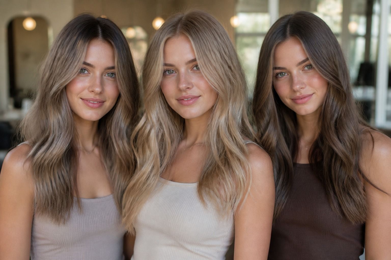
Hair is often where a promising palette becomes too severe. Deep Summer hair color can have depth, but it usually benefits from a cool or neutral finish and some visual softness. Ash brown, mushroom brown, cool medium brunette, smoky dark blonde, and muted espresso are sensible directions to test. A dark shade does not have to be flat; a few low-contrast variations through the lengths can keep it from creating a solid helmet effect around the face.
Black hair is not automatically wrong, just as blonde hair is not automatically harmonious. The question is whether the value jump from hair to skin is deliberate or accidental. If natural hair is medium brown with soft edges, an opaque blue-black dye may make the complexion appear lighter and the eyes less visible. A cool dark brown, shadow-root approach, or a slightly softened black can preserve depth while reducing the border effect. Check the result after the first wash, since salon lighting can make cool color look more forgiving than it will at home.
Makeup follows the same logic. A Deep Summer makeup contrast level often looks balanced with cool rose, mauve, berry, plum, taupe, and soft charcoal. Gray-brown liner can define the eyes without the graphic line of pure black. For cheeks, a cool rose or muted raspberry gives shape without reading orange. Lips can move from rosewood to cranberry and soft wine, depending on the rest of the face. The strongest lipstick in the drawer is not automatically the best test; start with a shade that is one step deeper than your everyday neutral.
When testing foundation or concealer, do not use makeup to force the skin into a cooler appearance. A matching base should disappear at the jaw, while color comes from the eyes, cheeks, and lips. If a product leaves a pink, gray, or yellow mask, the problem is the match rather than the seasonal palette. Seasonal color analysis is most useful for choosing relationships between colors, not for assigning a fixed undertone from a single selfie.
How to Test Deep Summer Colors in Real Outfits
Start with clothes you already own. Put on a plain top in black, then switch to charcoal, ink navy, and a muted berry. Keep the neckline and silhouette similar so the color has a fair comparison. Use a window with indirect daylight, remove strong overhead lighting, and take the photos at the same distance. I would avoid filters and the front-facing camera's automatic face correction; both can make a cool color look smoother than it feels in person.
Look for signs of cooperation rather than dramatic transformation. In a good shade, the eyes may look clearer, the skin more even, and the mouth easier to see. In a poor shade, the fabric may be the first thing you notice, shadows under the eyes can deepen, or redness around the nose can become more obvious. These are clues, not proof. A tired face, a recent tan, a different white balance, or a shiny fabric can change the result.
Test combinations, because Deep Summer is not only about single colors. Try charcoal with cool blush, ink navy with dusty teal, cool brown with muted rose, and aubergine with blue-gray. Then change one item at a time. If the outfit works only when every piece is muted and mid-depth, you may be leaning toward Soft Summer. If medium blues look best and very dark colors make you disappear, True Summer may be a better comparison. If the deeper combinations clarify the face without needing black, Deep Summer remains a reasonable working direction.
Take the palette outdoors before buying a major item. A coat that looked like a quiet blue-black under warm shop bulbs may turn nearly black in daylight. A berry sweater can become red-purple in one room and brown-red in another. Check the garment beside your face, then walk a few steps and look at it in a phone photo. The goal is not perfect color control; it is avoiding the expensive mistake of buying a shade that only behaves under one lamp.
A good deep summer color palette should make getting dressed easier, not narrower. Keep a few dependable dark neutrals, two or three light shades, and accents that can repeat across knitwear, lipstick, scarves, and small accessories. Once those relationships are clear, the season label becomes less important than the result: the clothes have enough depth to support you, enough softness to stay connected to your features, and enough coolness to leave the face looking like itself.