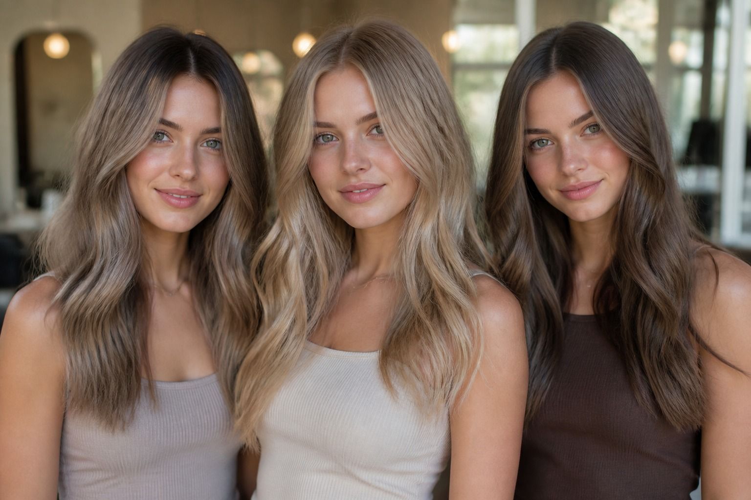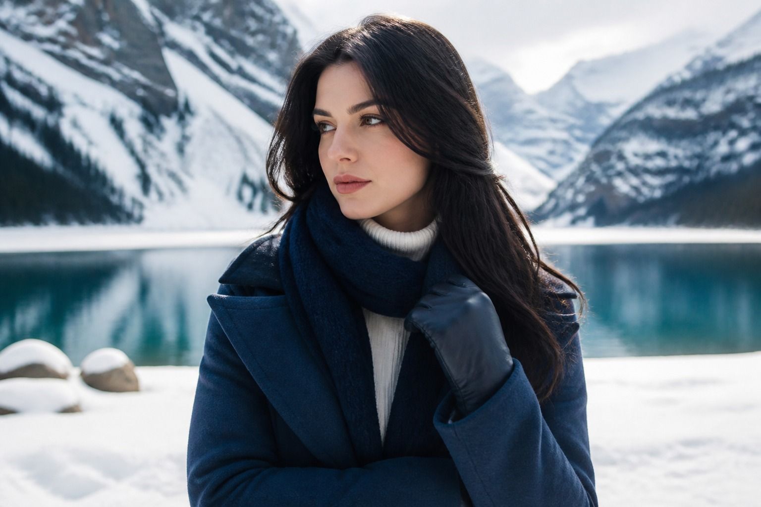
A Cool Winter palette makes sense when warm beige, dusty peach, and yellowed white seem to drain the life from your face, while crisp white, blue-red, and deep charcoal suddenly make your features look sharper. The useful question is not whether you can wear a certain color in isolation. It is whether the color has the right temperature, clarity, depth, and contrast when it sits beside your skin, eyes, and hair. This guide takes that four-part test into real clothes, hair choices, jewelry, and outfits that do not require a black uniform every morning.
Start with temperature, then check how clear the color feels
Cool Winter is usually the most temperature-focused of the Winter seasons. The colors should read cold rather than golden: blue-red cherry, raspberry, icy lavender, blue-green teal, cobalt, and blue-based purple are useful reference points. Their strength comes from clean pigment and firm edges. A grayish mauve can look elegant on a Soft Summer, but on a Cool Winter it may make the complexion look flat. A warm tomato red may be vivid, yet its yellow or orange base can compete with the face.
That does not mean every Cool Winter color has to be neon. Clarity is easier to understand by comparing two versions of the same family. Picture a clean fuchsia beside a muted rose, or cobalt beside a smoky denim. The first color has a more definite visual signal; the second has gray mixed into it. If your best colors make the whites of your eyes look brighter and your skin look more even, you are probably responding to clarity as much as to temperature.
Cool Winter is often confused with Bright Winter because both seasons can handle strong color. The difference is emphasis. Bright Winter usually needs a noticeable sense of saturation and may enjoy a warm-leaning electric coral or a very vivid green when the rest of the outfit is balanced. Cool Winter tends to look more settled in blue-based reds, icy pinks, emerald, cobalt, and cold violet. True Winter, in systems that use that label, sits close to the same territory and is often treated as a more neutral reference point between Cool Winter and the rest of the palette.
Seasonal color analysis is a styling framework, not a scientific measurement of identity or beauty. Draping, lighting, makeup, hair color, and personal taste can change what you notice. Use the season as a practical editing tool: it can tell you which colors deserve a closer look, while your own face in neutral daylight gets the final vote.
Build the base with cool white, black, and polished neutrals
The simplest Cool Winter wardrobe usually begins with a small group of neutrals that keep the palette clean. Cool white is more useful than creamy ivory for a top, shirt, or scarf worn near the face. It can be a sharp paper white, a soft icy white, or a very pale blue-white, but it should not look buttery. If bright white feels severe, try a winter white with a faint blue or gray cast instead of moving all the way into ecru.
Black can work beautifully, especially when it is broken up by a clear color, a bright lip, or a crisp neckline. The common mistake is treating it as the entire Winter palette. A black sweater under the face may create strong contrast, but an all-black outfit can leave the skin doing too much work. Add cobalt trousers, a fuchsia knit, a cool red bag, or a silver metal detail and the black becomes a frame rather than a blank wall.
Charcoal, graphite, navy, and blue-gray are valuable when black feels too hard for daytime. Choose navy with a blue base rather than a green cast, and look for graphite that stays clean instead of turning muddy. Cool taupe can work in small doses if it is distinctly gray and not camel. Stone, dove gray, and icy gray are often easier bridge colors than beige. They let a stronger accent lead without making the outfit look like a collection of unrelated jewel tones.
Jewelry follows the same temperature check. Silver, white gold, platinum, and bright steel usually echo the Cool Winter palette more naturally than yellow gold. This is not a rule about what you are allowed to wear. A small yellow-gold ring may be part of your personal style and still look fine. The practical distinction is scale: a large warm-gold necklace beside the face can make a cool pink or blue-red top look less clear, while a small mixed-metal detail may simply look intentional.
| Wardrobe role | Reliable Cool Winter choices | What to watch |
|---|---|---|
| Light base | Cool white, icy gray, pale blue | Yellowed ivory can make the skin look tired |
| Dark base | Black, graphite, ink navy | Very warm brown may overpower a cool accent |
| Soft bridge | Dove gray, blue-gray, cool taupe | Muted colors should still look clean, not dusty |
| Metal detail | Silver, platinum, bright steel | Large yellow gold adds a competing temperature |
Use jewel tones without making every outfit shout
Jewel tones are often the most enjoyable part of a Cool Winter color palette, but they need a little structure. Cobalt, sapphire, emerald, amethyst, fuchsia, magenta, cranberry, and blue-based red have enough presence to support the season. The trick is to give the strong color a clear job. Let one jewel tone carry the outfit, use a second as a small repetition, and keep the rest of the clothing in a controlled neutral.
A cobalt sweater with graphite trousers is an easy starting point. Add silver earrings and a cool red lip, and the look has a deliberate line from top to bottom. A fuchsia blouse can sit beside black or cool navy; it does not need another bright color to prove that it belongs. If you want two accents, match their intensity and temperature. Cobalt with fuchsia feels crisp because both are clear and cool. Cobalt with a dusty mustard can look interesting, but the contrast is warmer and more casual, so it needs a different styling intention.
Red is worth testing in person because the label covers a large range. Cool Winter reds often include cherry, raspberry, blue-red, cranberry, and ruby. A red that turns orange at the edge of the fabric is less reliable near the face, although it may work in a shoe or skirt. Pink can range from icy pink to vivid magenta. Pale colors should have a cool, clean lightness rather than a beige haze. A clear icy pink shirt can be delicate; a dusty salmon shirt may simply look disconnected.
Green also benefits from a close look at its base. Emerald, pine with a blue cast, blue-green teal, and some clear turquoise can sit comfortably in the palette. Yellow-green, moss, and warm olive create a softer or earthier effect and may be better kept away from the face if they make the skin look uneven. Purple is usually strongest when it has a blue or berry direction: amethyst, orchid, and cool plum are more cooperative than reddish aubergine with a brown cast.
Contrast is the part people often overdo. A Cool Winter can usually handle a dark-and-light pairing, but contrast does not mean using the brightest shade in every garment. Try black jeans, a cool white shirt, and a cobalt jacket. Or wear an all-charcoal base with a fuchsia scarf. The eye still gets a clear focal point, but the outfit has somewhere to rest. When a color feels too loud, reduce its surface area before rejecting it: a handbag, shoe, belt, or narrow stripe can be enough.
Choose Cool Winter hair colors by depth, not by trend
Hair color has a large visual area, so it can change the apparent contrast of the whole face. Cool Winter hair generally works best when the color stays neutral-to-cool and has enough depth to support the features. Blue-black, soft black, espresso without a red cast, deep ash brown, cool dark brown, and deep cool burgundy are possible directions. The right choice depends on your natural depth and the level of contrast you already have.
For naturally dark hair, a blue-black or cool espresso can look polished when the difference from the natural color is believable. If your natural hair is medium brown, a deep ash brown may keep the face defined without making the roots look like a hard graphic line. Cool burgundy or plum can be attractive when the base remains dark and the red reads berry rather than copper. The useful test is to view the color beside your skin in indirect daylight, not under the warm bulbs found in most salons and bedrooms.
Blonde is more complicated but not automatically off-limits. Icy beige-free blonde, pearl, cool ash blonde, and very pale neutral blonde can work when they do not create a washed-out gap between hair and face. A creamy blonde with strong yellow can make a Cool Winter complexion look sallow, especially when there is no clear color near the neckline. If you are moving lighter, a cool root shadow or a dark brow can preserve some contrast, while a flat all-over pale color may remove too much definition.
Before committing to permanent color, check three things. First, compare the proposed shade with your eyebrows, because a sudden lightening can make the face look less anchored. Second, look at the root line in daylight and in a phone photograph without a beauty filter. Third, wear a cool white or cobalt top while you evaluate it. A hair color that looks impressive against a salon cape may be too warm, too light, or too soft once it meets your actual wardrobe. Cool Winter hair colors should support your contrast scale, not force you to repaint every outfit around them.
Make the palette wearable when the occasion is ordinary
A seasonal palette becomes useful at the point where it helps with a Tuesday morning, a work meeting, or a jacket you already own. Start with three levels of contrast rather than one fixed formula. Low contrast can mean charcoal trousers, a soft cool-white top, and silver shoes. Medium contrast might pair ink navy with icy blue and a berry lip. High contrast could be black with cool white and cobalt. All three can belong to Cool Winter; the difference is the distance between the lightest and darkest parts of the outfit.
For work clothes, use one strong color in a familiar shape. A cobalt blazer over a graphite dress is easier to wear than cobalt trousers, a fuchsia shirt, and a bright purple bag on the same day. If your office wardrobe is mostly black and navy, change the top layer first: a raspberry cardigan, an icy lavender blouse, or a blue-red jacket can bring the palette to life without requiring new shoes and accessories. The color should look chosen, while the silhouette can remain quiet.
Casual clothes need even less theory. Dark denim can act as a practical neutral if it is clean blue rather than heavily yellowed or faded into dusty gray. Add a cool white T-shirt and a fuchsia sneaker, or a charcoal sweatshirt with an emerald beanie. A black leather jacket can take cobalt, cherry, or icy pink underneath. If the outfit feels too stark, introduce texture rather than warmth: brushed wool, ribbed cotton, matte leather, or a soft knit will make the colors easier to live in without changing their temperature.
The best Cool Winter wardrobe is usually selective rather than strict. Keep the colors that make your face look rested, the neutrals that give you reliable combinations, and the stronger shades that make getting dressed more enjoyable. Leave room for sentimental colors, practical shoes, and clothes that solve a real problem. A palette should sharpen your choices, not turn a morning in front of the closet into an exam. When cool temperature, clean color, suitable depth, and your preferred contrast meet in one outfit, the result tends to look composed before anyone notices why.